
Websites for Batting Cages, Golf Simulators & Sports Training Facilities should be bringing in bookings every day. Not just sitting there.
If you run a facility like this, you already know something feels off.
People are searching. They’re clicking. But bookings? Not where they should be.
And most of the time, the issue isn’t your service. It’s your website.
Why Most Websites for Batting Cages, Golf Simulators & Sports Training Facilities Quietly Lose Customers
Here’s the thing.
Most batting cage and golf simulator websites look fine. Clean enough. Some nice photos. Maybe a booking button somewhere.
But “fine” doesn’t convert.
Think about how your customers behave. A parent looking for training for their kid. A group of friends trying to book a simulator. An athlete searching late at night after practice.
They don’t want to think. They don’t want to hunt for info.
If your site loads slow…
If it’s clunky on mobile…
If it’s not obvious what to do next…
They leave.
And they don’t come back.
They go to the next facility that made it easier.

What a High-Converting Sports Facility Website Actually Needs
Let me explain.
A good-looking site is nice. But a working site? That’s where things change.
Here’s what actually matters:
- Fast load speed (especially on mobile)
- Clear call-to-action (Book Now, Reserve a Cage, etc.)
- Simple navigation (no guessing)
- Real photos of your facility (not stock images)
- Instant credibility (reviews, testimonials, results)
- Seamless booking experience
It’s not flashy. It’s not complicated.
The best websites for batting cages, golf simulators & sports training facilities are built around one thing. Making it easy to book.

Why DIY Builders Like Wix Fall Short (Even If They Look Fine)
Honestly, this is where most facility owners get stuck.
Wix, Squarespace, even Shopify sometimes.They’re easy. Cheap. Fast to launch.
But they’re not built for performance.
You might get something that looks good. But behind the scenes?
- Slower load times
- Limited SEO control
- Weak mobile optimization
- Clunky booking integrations
This is what most DIY-built sites are missing. A clean, mobile-first experience that makes booking feel effortless.
And here’s the kicker…
You don’t notice the problem right away.
It’s a slow leak. A few lost customers here. A few missed bookings there.
Over time, that adds up.

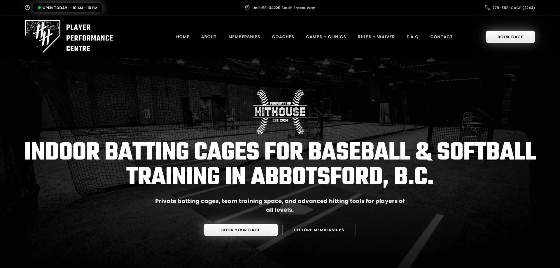
Real Example: What Happens When It’s Done Right
I’ve created Websites for Batting Cages Golf Simulators & Sports Training facilities like Diamond Dreams and HitHouse.
Both solid businesses. Great training. Strong community.
But their websites weren’t doing them justice.
After rebuilding their sites with performance and conversion in mind:
- Faster load speeds
- Clear booking flow
- Stronger first impression
- Better mobile experience
The difference?
More inquiries. More bookings. Less friction.
Not magic. Just structure.
So What Should You Do Next?
You’ve got a few options.
You can keep your current site and hope it improves.
You can try to rebuild it yourself.
Or you can have it done properly.
There’s no wrong answer.
But here’s the honest truth…
Your website is your front desk when you’re not there.
It’s answering questions.
It’s building trust.
It’s either converting people or turning them away.
And once you see it that way, it’s hard to ignore.
Final Thought
You don’t need something over the top.
You need something that works.
Something fast. Clear. Built for how your customers actually behave.
Because right now? People are already looking for what you offer.
The only question is…
Are they choosing you?
Get in touch here