Why Your Website Conversion Rate Might Be Failing You
Most websites don’t have a traffic problem—they have a conversion problem. You might be getting plenty of clicks, but if your design isn’t built to guide visitors, you’re losing leads every single day. Slow load times, poor layout, confusing CTAs… they all quietly kill your website conversion rate.
As a solo web designer, I specialize in identifying these blind spots. I don’t just design for style—I build with results in mind.
Tip: If you’re redesigning your site, prioritize mobile performance and CTA placement before anything else.
The Real Reason Visitors Aren’t Taking Action
Most small business sites fall into the same trap: they assume if the site “looks good,” it’s enough. But here’s the truth—conversion is about clarity, not just aesthetics.
People leave when they can’t find what they need fast. They hesitate when they’re unsure what to do next. They bounce when there’s no trust built on the page.
That’s where design makes or breaks performance. Everything—from your homepage layout to the microcopy on a button—impacts your website conversion rate.
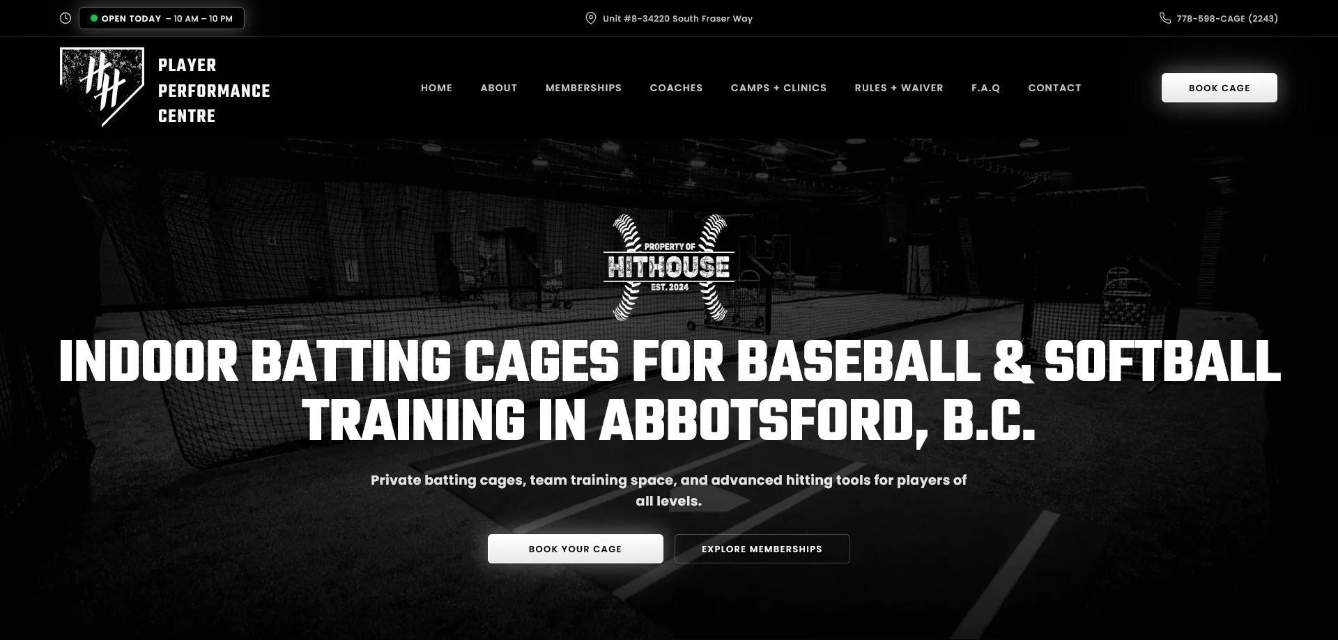
Example: One client had a stunning homepage… with no visible CTA above the fold. We added a sticky call button and contact form preview. Their leads jumped 42% in one month.
Want to understand why visitors bounce before converting? Check out this guide on Conversion Rate Optimization by CXL.
How I Design Websites to Increase Conversion Rates
I combine web design, UX, and marketing psychology to guide visitors from interest to action. My process is based on clarity, simplicity, and strategic design.
Clear Messaging Above the Fold
The first thing a visitor sees needs to answer: What do you do? Who is it for? Why should they care? I design headers that get straight to the point.
Strategic CTA Placement
Calls-to-action aren’t slapped at the bottom of the page. I place them at intentional intervals, often above the fold, after benefit sections, and again near testimonials.
Visual Trust Elements
I design with trust in mind—Google reviews, testimonials, recognizable badges. These add instant credibility without overwhelming the design.
Mobile-First Responsiveness
Over 70% of traffic is mobile. My designs prioritize thumb-friendly layouts, fast load times, and CTA buttons that are easy to tap.
A Real-World Example: From Dead Leads to Daily Bookings
I worked with a solo salon owner whose site looked fine—but she hadn’t had a single online booking in weeks. I rebuilt her homepage to focus on one thing: conversions.
- Clear service headlines
- A single CTA that stood out
- Google Reviews embedded for proof
Within two weeks, she had 9 new bookings from organic traffic alone.
Want a Website That Converts?
If your site isn’t converting, it’s not working. Period.
Want help increasing your website conversion rate with smart design and strategy? Let’s talk.


